
Finally...my website should all be working now.
I'm a little disappointed as I still want to put page boarders and tweak a few things, but as I have never used Dreamweaver before, I'm actually quite impressed with myself!
Please take a peek and leave comments - feedback is always useful!
www.eleanorstobbart.co.uk
Saturday, 22 December 2007
Wednesday, 19 December 2007
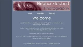
Woooooooo!Its up and running...well, most of it anyway!
I've had to take the boarders out from my original design for now, until I work out how to do it in dreamweaver.
Also, most of the galleries work - there are a couple that I haven't put up yet but please have a look and any feedback would be appreciated.
www.eleanorstobbart.co.uk
I've had to take the boarders out from my original design for now, until I work out how to do it in dreamweaver.
Also, most of the galleries work - there are a couple that I haven't put up yet but please have a look and any feedback would be appreciated.
www.eleanorstobbart.co.uk
Monday, 17 December 2007
Vis Com - PDP
Grrrrr...I knew I shouldn't have used frontpage for the website!
What a pain... It shifts the allignment of the text on widescreen computers.
AAAAAAAAAHHH!!!!!
Oh, well...I will have to re-do it in Dreamweaver (which I have no idea how to use so this will be amusing)...
What a pain... It shifts the allignment of the text on widescreen computers.
AAAAAAAAAHHH!!!!!
Oh, well...I will have to re-do it in Dreamweaver (which I have no idea how to use so this will be amusing)...
Wednesday, 12 December 2007
Vis Com - PDP
Further to my website design, I have decided that I will upload the site and use it for work and portfolio purposes. I have hosting space but need to arrage a domain name for the site.
I have also started to develp business cards to match the design of the website.
The first was based on the website colours and background;
I have also started to develp business cards to match the design of the website.
The first was based on the website colours and background;
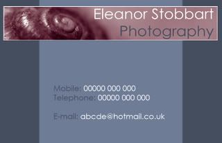
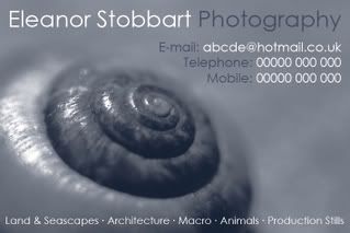 Even though I was quite happy with this, I couldn't help wondering how the original banner image would work in purple. Curiosity got the better of me and I had to try it...
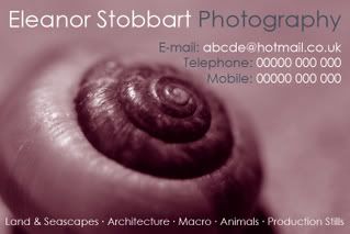 Now that was a silly idea!I don't know which I prefer!I do like the blue, but when you sit it against the purple it looks very dull!Aaaaaaaaaaaaaaaaaaaaaaaaaaaaaaahhh!!! I can't decide!Think I'm going to have to sleep on it.
Tuesday, 11 December 2007
Vis Com - PDP
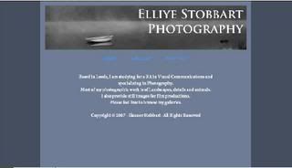
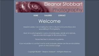
For my PDP I decided to do something that will be functional and useful to me.I have taken the process of design and added my interest of photography...what came out of this? Well, I have decided to build myself a website.Having looked at other photographers web sites, the majority of websites have a white background with minimal use of colour and a substantial amount of text.I had a rough idea of what I wanted from my site - simple, easy to use and to look inviting as well as functional.I have made several trial site layouts as shown below.
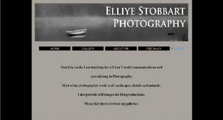
The first, I felt that the white and black was too much of a contrast, making the white appear far too bright to be looking at on a monitor, so I tried the background with a grey to tone it down. This made the site look very dull and almost depressing so, I decided to experement a little more and add some interest to the page.
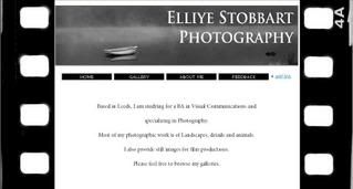 This again, I felt was too contrasty and also the film boarders that had seemed to be a good idea looked to gimiky...So...back to the drawing board!I decided to add more colour...
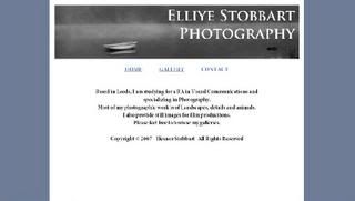 This was starting to look a bit better. Again, I tried the main background with both white and grey, but it just felt very bleak still. The banner also wasn't sitting and the greys in the images were still holding that depressing and unwelcoming feeling.
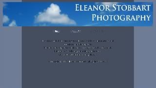 I didn't feel that the first two manners were sitting very well. I had gone off the original one as it was very dull and the second was just too much blue...so I tried another...
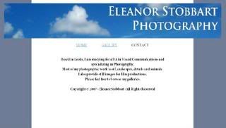
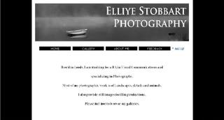
 I quite liked this but felt that the banner image was still too bright and made the rest of the page look dull.I also wanted a strong, impacting image to use as a banner that I could continue using for logo purposes...
The first, I felt that the white and black was too much of a contrast, making the white appear far too bright to be looking at on a monitor, so I tried the background with a grey to tone it down. This made the site look very dull and almost depressing so, I decided to experement a little more and add some interest to the page.
This again, I felt was too contrasty and also the film boarders that had seemed to be a good idea looked to gimiky...So...back to the drawing board!I decided to add more colour... This was starting to look a bit better. Again, I tried the main background with both white and grey, but it just felt very bleak still. The banner also wasn't sitting and the greys in the images were still holding that depressing and unwelcoming feeling.This time, I kept the colours but changed the banner. So much brighter and more welcoming! But I felt that this was perhaps a little too bright so I tried a grey background aswell. This just brought back the gloomy look again. At this point I was starting to get quite frustrated. How difficult can it be to find background colours?!?!
So, I played with different shades of blue, green, yellow, grey...and changing the text colour until I was finally happy!
Then I tried numerous banners to see what would sit well and swapped the boarders and the centre background colours over time and time again and changing the font colours until they were easy to read...
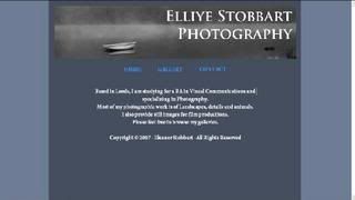
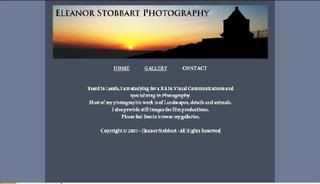
I didn't feel that the first two manners were sitting very well. I had gone off the original one as it was very dull and the second was just too much blue...so I tried another...I quite liked this but felt that the banner image was still too bright and made the rest of the page look dull.I also wanted a strong, impacting image to use as a banner that I could continue using for logo purposes... I really liked this one. I felt that the colours sat well together and the banner image was strong.To give it slightly more definition, I decided to add a thin white boarder to the banner.
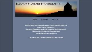
Finally, I was satisfied with the site design. It was warm, simple, easy to read and functional.I have designed 3 pages, all with the same layout, colours and banner. The 'Welcome/Home' page, 'Contacts' and 'Galleries'. The galleries themselves will be of a different layout to make it simple to use but the colours will remain generic throughout the site.This project has left me with a web site design for my photographic work and has given me a grater understanding of web writing and how frustrating it can be!
Subscribe to:
Posts (Atom)