
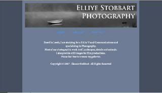
Finally...my website should all be working now.
I'm a little disappointed as I still want to put page boarders and tweak a few things, but as I have never used Dreamweaver before, I'm actually quite impressed with myself!
Please take a peek and leave comments - feedback is always useful!
www.eleanorstobbart.co.uk
Saturday, 22 December 2007
Wednesday, 19 December 2007
Woooooooo!Its up and running...well, most of it anyway!
I've had to take the boarders out from my original design for now, until I work out how to do it in dreamweaver.
Also, most of the galleries work - there are a couple that I haven't put up yet but please have a look and any feedback would be appreciated.
www.eleanorstobbart.co.uk
I've had to take the boarders out from my original design for now, until I work out how to do it in dreamweaver.
Also, most of the galleries work - there are a couple that I haven't put up yet but please have a look and any feedback would be appreciated.
www.eleanorstobbart.co.uk
Monday, 17 December 2007
Vis Com - PDP
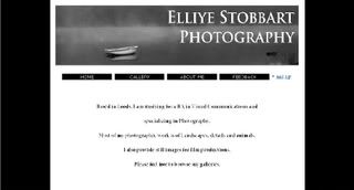
Grrrrr...I knew I shouldn't have used frontpage for the website!
What a pain... It shifts the allignment of the text on widescreen computers.
AAAAAAAAAHHH!!!!!
Oh, well...I will have to re-do it in Dreamweaver (which I have no idea how to use so this will be amusing)...
What a pain... It shifts the allignment of the text on widescreen computers.
AAAAAAAAAHHH!!!!!
Oh, well...I will have to re-do it in Dreamweaver (which I have no idea how to use so this will be amusing)...
Wednesday, 12 December 2007
Vis Com - PDP
Further to my website design, I have decided that I will upload the site and use it for work and portfolio purposes. I have hosting space but need to arrage a domain name for the site.
I have also started to develp business cards to match the design of the website.
The first was based on the website colours and background;
I have also started to develp business cards to match the design of the website.
The first was based on the website colours and background;
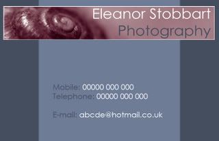
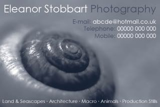 Even though I was quite happy with this, I couldn't help wondering how the original banner image would work in purple. Curiosity got the better of me and I had to try it...
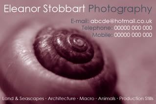 Now that was a silly idea!I don't know which I prefer!I do like the blue, but when you sit it against the purple it looks very dull!Aaaaaaaaaaaaaaaaaaaaaaaaaaaaaaahhh!!! I can't decide!Think I'm going to have to sleep on it.
Tuesday, 11 December 2007
Vis Com - PDP
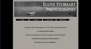
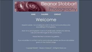
For my PDP I decided to do something that will be functional and useful to me.I have taken the process of design and added my interest of photography...what came out of this? Well, I have decided to build myself a website.Having looked at other photographers web sites, the majority of websites have a white background with minimal use of colour and a substantial amount of text.I had a rough idea of what I wanted from my site - simple, easy to use and to look inviting as well as functional.I have made several trial site layouts as shown below.
The first, I felt that the white and black was too much of a contrast, making the white appear far too bright to be looking at on a monitor, so I tried the background with a grey to tone it down. This made the site look very dull and almost depressing so, I decided to experement a little more and add some interest to the page.
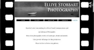 This again, I felt was too contrasty and also the film boarders that had seemed to be a good idea looked to gimiky...So...back to the drawing board!I decided to add more colour...
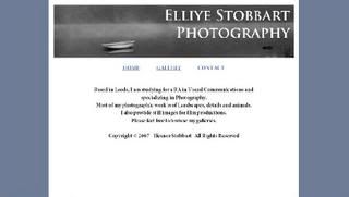 This was starting to look a bit better. Again, I tried the main background with both white and grey, but it just felt very bleak still. The banner also wasn't sitting and the greys in the images were still holding that depressing and unwelcoming feeling.
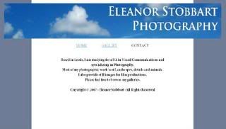
 I didn't feel that the first two manners were sitting very well. I had gone off the original one as it was very dull and the second was just too much blue...so I tried another...
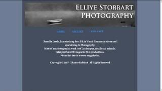
 I quite liked this but felt that the banner image was still too bright and made the rest of the page look dull.I also wanted a strong, impacting image to use as a banner that I could continue using for logo purposes...
The first, I felt that the white and black was too much of a contrast, making the white appear far too bright to be looking at on a monitor, so I tried the background with a grey to tone it down. This made the site look very dull and almost depressing so, I decided to experement a little more and add some interest to the page.
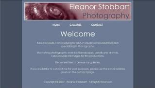
This again, I felt was too contrasty and also the film boarders that had seemed to be a good idea looked to gimiky...So...back to the drawing board!I decided to add more colour... This was starting to look a bit better. Again, I tried the main background with both white and grey, but it just felt very bleak still. The banner also wasn't sitting and the greys in the images were still holding that depressing and unwelcoming feeling.This time, I kept the colours but changed the banner. So much brighter and more welcoming! But I felt that this was perhaps a little too bright so I tried a grey background aswell. This just brought back the gloomy look again. At this point I was starting to get quite frustrated. How difficult can it be to find background colours?!?!
So, I played with different shades of blue, green, yellow, grey...and changing the text colour until I was finally happy!
Then I tried numerous banners to see what would sit well and swapped the boarders and the centre background colours over time and time again and changing the font colours until they were easy to read...
I didn't feel that the first two manners were sitting very well. I had gone off the original one as it was very dull and the second was just too much blue...so I tried another...I quite liked this but felt that the banner image was still too bright and made the rest of the page look dull.I also wanted a strong, impacting image to use as a banner that I could continue using for logo purposes... I really liked this one. I felt that the colours sat well together and the banner image was strong.To give it slightly more definition, I decided to add a thin white boarder to the banner.
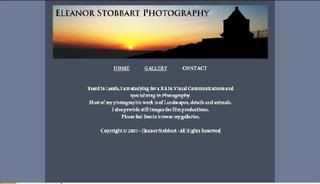
Finally, I was satisfied with the site design. It was warm, simple, easy to read and functional.I have designed 3 pages, all with the same layout, colours and banner. The 'Welcome/Home' page, 'Contacts' and 'Galleries'. The galleries themselves will be of a different layout to make it simple to use but the colours will remain generic throughout the site.This project has left me with a web site design for my photographic work and has given me a grater understanding of web writing and how frustrating it can be!
Thursday, 29 November 2007
The 39 Steps - Music Video
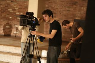
I have recently had the opportunity to work on a music video for 'The 39 Steps' on their song 'I'll be there' (http://www.myspace.com/the39stepsmusic) I was working as a stills photographer and extra for Aspinall Film, who I previously worked with on another music video (details can be found in an earlier blog).

Sunday, 11 November 2007
Long Lost Leeds
'Explore Leeds & make a book about it' was the task set and with the 'it' being anything I liked, I chose the obvious for me...places of historc interest! I had great fun exploring and searching for different places in and around Leeds and researching into their history.
I especially liked Robin Hood's Grave as I am very interested in folklore and myths and it was also the hardest place to find and gain permission to visit and photograph!
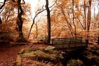
My favourite photos have got to be the Abbey Light Railway (they just look really nostalgic and the editing effects have worked well on them) as well as Harewood House as the image is so dominant and over powering. Anyway...here are some of the photos that I have taken and used for this piece of coursework.
Long Lost Leeds
Friday, 2 November 2007
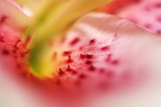
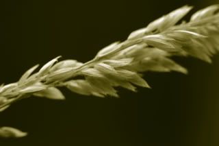
Macro
I quite enjoy Macro photography as well.It makes you look at subjects quite differently and see them in a different light with far more detail.Its great fun just to mess around with and it works really well with plant life.The two images below are some of my favouries because of the detail that you see and how different they look up close.
One Of My Aspirations...
I would love to be a wildlife photographer for the National Geographic.It would be the most amazing job ever!Unfortunatley, I haven't had the chance to travel that much but I've still managed to take some photos that aren't too obvious that the animals are in captivity...

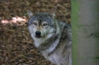
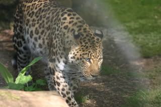
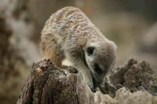
I like all of these images because they could have quite easily have been taken in the wild, when in fact they were all taken at my local zoo.The other reason that I particulary like them, is because I have always wanted to take wildlife images and there is so much detail that you don't notice until you can get close up or study photographs as these types of animals are not directly part of our everyday lives.I paricularly like the Otter image, mainly because he was sat there squeeking on a branch so pitifully for ages - he was so cute!The Wolf image is another favourite, purely because he was staring directly at me from quite some distance and it just makes me wonder what is going through his head.
Thursday, 1 November 2007
Photographers Rights
I've just come accross this site that explains the rights for UK Photographers and thought it may be of interest or of use to people.
UK Photographers Rights
Thought I would post it before I forget!
UK Photographers Rights
Thought I would post it before I forget!
Sunday, 28 October 2007
Coursework...
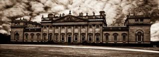
Thanks to my coursework, I have had an added excuse to get out and about taking photographs for a book that I have to produce.I've found some brilliant places around Leeds although there aren't that many in Leeds itself that facinate me too much...Harewood House is a good place to go if you want some fresh air.Its about 7 miles outside of Leeds and there is a regular bus service if you can't drive, plus...there is free entry for students on a Wednesday.There is not only the House at Harewood but spectacular views over the estate, a bird garden (with Peggers and flamingos), gardens, lakeside walks, a cascade waterfall, deer park and even a planetarium.There is also a castle on the Harewood Estate that I reeeeeeeeeeeeeeally wanted to include for my coursework, however, it is not on the public part of the estate and is very unsafe so you are only allowed access if you are accompanied. Unfortunatley, it is far too dangerous at the moment and all acess is strictly prohibited.
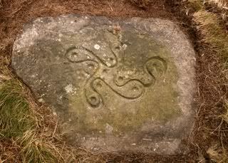
 Rombald's Moor or Ilkley Moor is another great place to roam. There are numerous sites on the Moor with standing stones and others with grafitti examples from around the Neolithic & Bronze ages. You will need an OS Map though if you don't know the Moors very well as these sites aren't sign posted.There is also a really nice woodland area to the south of the 'Swastika Stone', perfect for Autumnal photography or just to provoke your inspiration.
Saturday, 27 October 2007
Flickr Site
Finally I have got off my backsde and updated my flickr page...well, partially updated!Flickr is an image hosting and sharing site, enabling others to view your photographs easily online.Click below to have a look;
MY FLICKR PAGE!
MY FLICKR PAGE!
Sunday, 21 October 2007
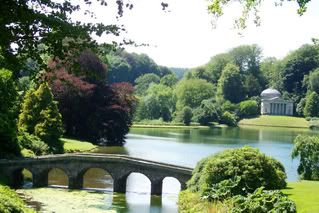
One of my favourite places...
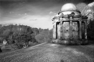
I love this place, Stourhead. Its so peaceful and one of the most inspiring places I have been... The black and white image of 'Apollo's Temple' is definatly my favourite out of these two images. I like the lighting and how the small temple looms over the lake and surrounding garden - it has a very dominant prescence.
I also really like temples and think that this stems from my interest in history once again and the mythology of the Ancient Greeks. The scene where Mr Darcy admits to Elizabeth in the new version of 'Pride and Prejudice' was shot at this temple which adds to the romance of the location.
The colour image below (also Stourhead) was taken in the summer 2006 and was literally a snap shot as I was there for work at the time. I like the intense greens in this image and how bright and warm that it feels, but regret the fact that I didn't have enough time or the best equipment with me on this Summer's day to take more care.
Tuesday, 16 October 2007
Poisonous Emblem - KBC Video
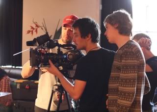
This music video was shot at the start of 2007 by a friend in Leeds.My involvement was limited to assisting with props and costumes on this video.However, I will be working on future videos with Aspinal Productions especially with still photography.
Poisonous Emblem - KBC Video
Monday, 15 October 2007
Some of my Photos...
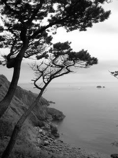
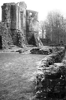
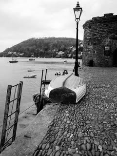
These are a few of my favourite photos.I really like black & white and feel that often, there is more emotion in them than you would find in colour, especially when it suits the subject matter as the images below do.I have a passion for history, landscapes and costal scenes, of which a lot of my work is focused around and, although I do enjoy other aspects, this is where my main focus obviously lies.I think this has a lot to do with the fact that I am comfortable in these places and the romance of them is brilliant to work with especially with a nostalgic feel. If I'm in a place of tranquil, natural and historical background, I always have my camera at hand!
Subscribe to:
Posts (Atom)